Doesn’t it seem that brands everywhere are changing up their logos for a more minimalist approach? Does this mean that logo design itself is out of fashion for branding? What are some reasons for having text-based logos? And what are some things you could actually be missing out on by going the minimalist approach for your brand? In today’s post, we’ll explore possible answers to these questions so that you can be more equipped to make better decisions for your brand design moving forward.
It’s no secret that there are some obvious benefits that brand designers are finding when they’re moving into a minimalist approach for their brands. And those we’re going to dive into first.
Online Versatility
The first benefit is online versatility. A text-based logo will work at all different sizes on your website. So, you don’t have to worry about accommodating the different sizes of your logo to achieve the best readability. Currently, most successful logos are utilizing a Sans Serif font, which is considered the best option for readability.
- There are lots of online tools you can tap into to create your own logo that will bring success to your brand. Check out some of them at https://create.vista.com/features/background-remover/.
The online versatility benefit also leads us into another benefit of having a text-based logo, which we’re going to discuss further.
Shifting Trends
The ability to accommodate fast-shifting trends without having to rebrand can save you a lot of time, bother, and hard-earned dollars, of course. On average, companies go through rebrands every couple of years to stay up to date with the current trends. This is an effective and wise approach, yet it might be quite costly.
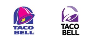
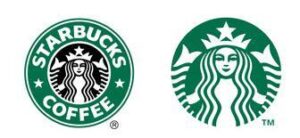

Having a text-based logo will actually be more cost-effective. This allows brands to transition and accommodate these trends a little bit faster.
More than a Logo
Another reason to focus on a minimalistic approach to your log design is that brands are so much more than just their logo design. A company’s personality, mission, and audience altogether create a strong brand identity. And you could even argue that the focus on logo design is less today than it was yesterday. However, this leads us to pretty stick points on why going the minimalistic route for your logo actually might leave you with some FOMO, fear of missing out on some pretty big things. And we’re going to walk you through what those are.
Lack of Identity
The first con is the lack of visual identity. Going the route of having a Sans Serif-based font can actually lead you to miss out on something huge like iconic brand elements. Well, you might be thinking ‘If our brand is more than a logo (which it is), then what’s the big deal?’ Now it’s all about looking at ways to strengthen the brand. And the iconic brand element is a great way to add power to your connection with your audience through visual retention. What if Nike lost their check? What would McDonald’s be without the golden arches? And what would Apple be without its signature apple?

As you may see, these companies’ brand identity is reinforced by the fact that they have an iconic brand element within their logo.
Missing Logo Personality
Another con to take note of is that your marketers and designers that work on your brand might not actually have to get creative, because you’re missing a personality connection through your logo and brand identity itself. You may have to lean heavily on creative messaging, eye-catching graphics, and unique user experiences to add that personality connection with your intended audience. But if all brands start looking just the same, how do you work on connecting and standing out in an overcrowded online market. You can have the best of both worlds: a modern, readable, and extremely versatile logo while maintaining a strong brand personality and iconic brand element with it. So, consider having a unique icon, but reserving your brand name to be in text for the benefits of readability. Here are some great rebrands that are doing fantastic jobs: Airbnb, Spotify, LinkedIn, and even Animal Planet.
At the end of the day, if you want to move your brand to a more modern and minimalist design, you can still keep a little bit of your special sauce to express your brand identity.
